Accessible
Digital Design
Colour Contrast
Colour Contrast Ratio
Image: Close up of a multi-colored grid with web hex codes.
Overview
Colour is one of the fundamental design elements that help designers create focal points and lead the viewer’s eye. We use colour to create moods, create psychological impact and harmony in our creative work. When we consider accessibility and inclusive design it’s important to recognize that the perception of colour is not universal. Colour deficiencies affect approximately 8% of men and 0.5% of women and can result in the misunderstanding of information if insufficient tonal contrast is used. Colour contrast is an important consideration for typography since it directly relates to legibility. It is also a key factor in designing effective charts, graphs, and maps to ensure the visibility of all the components (Colourblind Awareness, 2021).
Developing an Understanding
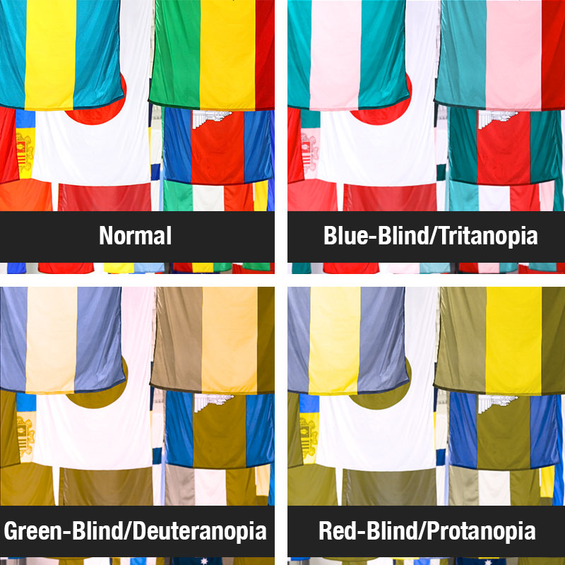
When you are designing graphics, documents and presentations, it is also important to be mindful of how different people see colour. Colour Vision Deficiency (also known as colour blindness) does not mean that people only see in black and white and cannot see colour, they just see the colours in a different way. There are a number of variations of vision deficiency including: Deuteranomalia (which makes all the colours look a little faded), Protanopia (which makes everything seem a little green), and Tritanopia (greenish-pink tones) (Colblindor, n.d.).
Here is a link to Colblisopen new window, a colour blindness simulator where you can simulate various forms of colour vision deficiency using one of your own images (Colblindor, n.d.).
Colour Contrast Ratio
Colour contrast ratio is a benchmark we can use to ensure that foreground elements are perceivable against their backgrounds to all readers. Although typically used in web design, it is equally applicable to digital and print design.
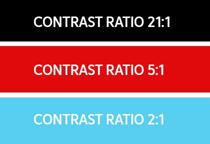
The contrast ratio is a measure of the difference in perceived ‘luminance’ or brightness between two colors. This brightness difference is expressed as a ratio such as 21:1 for black text on a white background. These ratios can be difficult to eyeball and several web based tools have been developed to assist designers in testing their colour choices. In considering access and inclusion at the onset of a project, test contrast ratios early to establish colour palettes and suitable foreground/ background combinations that will support the accessibility of your design.
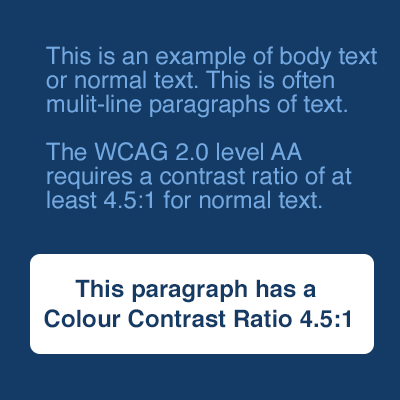
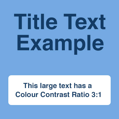
Suggested colour contrast ratio is:
4.5:1 for small text (eg. body copy)
3:1 for large text (eg. titles, headings)
Web-based, free tools such as the WebAim Colour Contrast Checker opens in new window or the Paciello Group’s Colour Contrast Analyzer Tool opens in new window are effective ways of ensuring that the colours you plan to use in your design meet the colour contrast ratio.
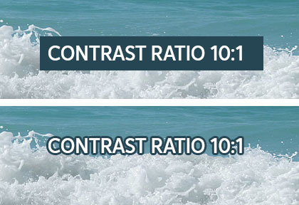
Text over background images, gradients or transparent elements must still adhere to the color contrast ratio. These can be harder to measure since the foreground is not a single hue. It is recommended to use the lightest background hue to test against. Strokes and outer glows can improve the contrast ratio but may not always complement your design.