Accessible
Digital Design
Typography
Type Styling
Developing an Understanding
Type size for accessibility is another controversial topic with many guidelines suggesting specific point sizes. The size of the text to support legibility and readability is dependent on many factors such a font choice, color contrast, context, etc., which is why accessible type sizes can’t be reduced to a single value. While 12pts is the common recommendation, it is recommended to consider the x-height of your typeface and recognize that taller x-heights will make your type appear larger than what the point size indicates. The goal with accessible typography is to create ‘clear print’, a design that is readable by most. On the other hand, large print which is typically set at 16-18pts for body copy, is a format that is a suitable alternative that is specifically designed for the low vision community.
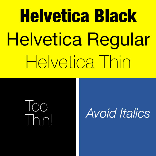
In addition to type size considerations, other styling factors that can disrupt readability is the overuse of italics, bold and underline. Avoid using these type styles for paragraphs of text although they can be suitable for 1-2 lines. Extensive use of all caps can also disrupt readability since the letter forms are typically uniform in height. Again, all caps can be suitable for 1-2 lines but is not recommended for paragraphs.
Lastly, when using all caps, be sure to use the character styles to change the display rather than typing in capital letters. For screen reader users, consecutive capital letters can be interpreted as an acronym and can confuse the reader.
Deepening your Understanding
The Canadian National Institute for the Blind (CNIB) has recommended guidelines that ensure all visual communication including websites, signs, books, brochures and packages be accessible and as barrier-free as possible. The CNIB recommends the following ways to make print as clear and readable as possible for everyone (CNIB, n.d.).
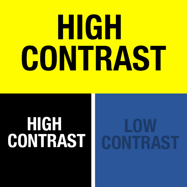
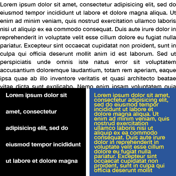
Contrast
Use high-contrast colours for text and background. Good examples are black or dark blue text on a white or yellow background, or white or yellow text on a black or dark blue background.
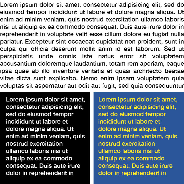
Type Colour
Printed material is most readable in black and white. Restrict coloured text to things like titles, headlines or highlighted material.
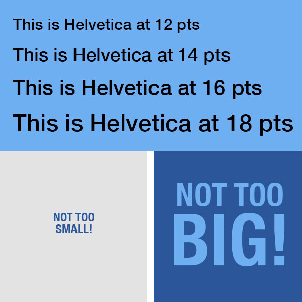
Font Point Size
Keep your text large, preferably between 12 and 18 points, depending on the font. (Point size varies among fonts.)
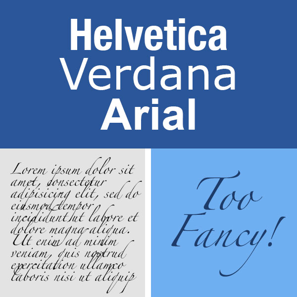
Font Family and Font Style
Avoid complicated or decorative fonts. Choose standard sans serif fonts with easily recognizable upper- and lower-case characters. Arial, Verdana and Helvetica are good choices.
Font Heaviness
Opt for fonts with medium heaviness and avoid light type with thin strokes. When emphasizing a word or passage, use a bold or heavy font. Italics or upper-case letters are not recommended.
Leading
Leading is the space between lines of text and should be at least 25 to 30 per cent greater than the point size. This space lets readers move more easily to the next line of text. Too much leading, however, makes type harder to read. Heavier typefaces will require slightly more leading.
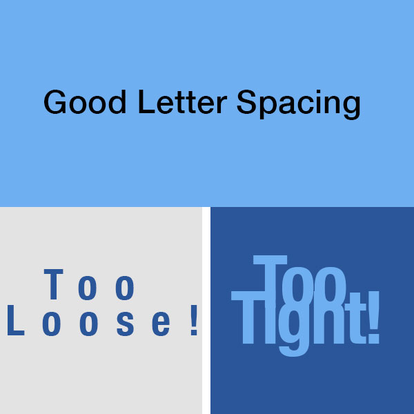
Letter Spacing
Don’t crowd your text and keep a wide space between letters.
— from CNIB Clear Print Accessibility Guidelines
Image: Access Ability 2: A Practical Handbook on Accessible Graphic Design book cover.