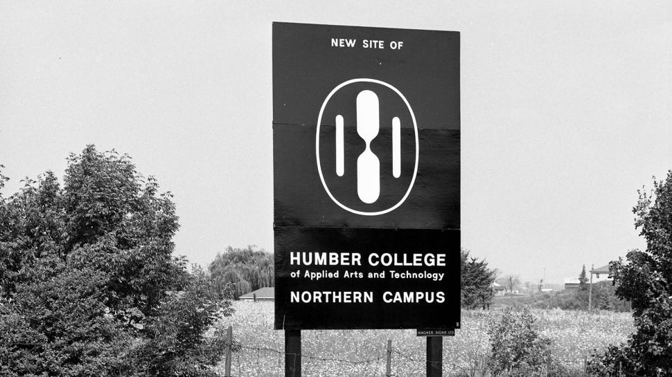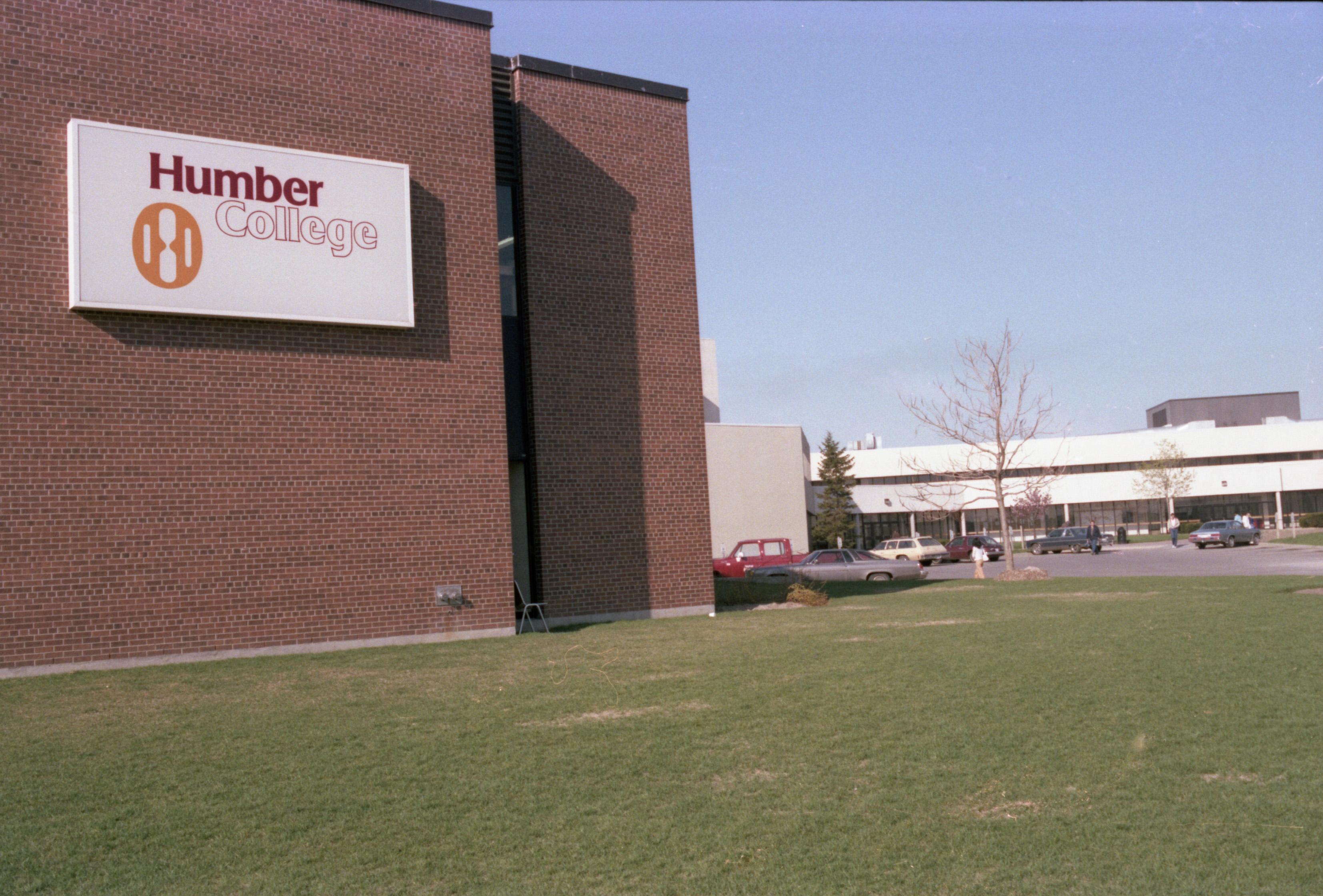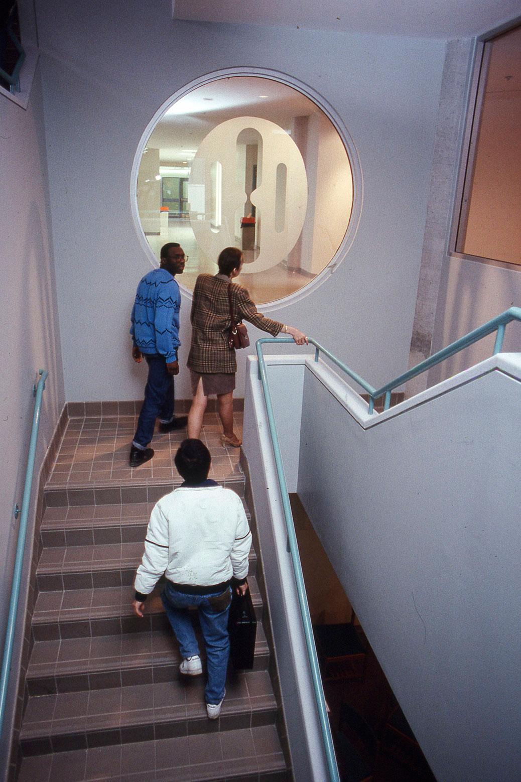
Have you seen this symbol before? Perhaps as you walk through the NX building at North Campus or on an old letterhead or course calendar you’ve seen lying around?
You may have asked yourself, what exactly does this symbol represent? Perhaps a plate with a serviette, a face, or some sort of electrical plug?
Well, this is Humber’s first logo that was in use from 1968 to 2000. Humber’s first newspaper “This is Humber College” (which is available online through the Archives, see page 11 for an article about the logo) contains a description of the logo.

Graphic designer Dean Charters created the design and intended the logo to be a bold “do-it-yourself” type of brand identity.
“With this design, you first become aware of something. You look at it and say, ‘What is it?’ Then you see it’s an H. Really, it’s a do-it yourself symbol,” said Charters in the 1968 article. “We've invited you to fill in the missing horizontal bar and have made you participate. You've completed a mental exercise which you'll find difficult to forget. From now on, you'll always associate the symbol with Humber College."

In the middle of the logo, between the two vertical bars is a sandglass-type figurine, which Charters intended to symbolize “a student passing through time to reach the objectives of (their) education”.
The whole logo is completed by an ellipse, which was intended to represent the idea of education as “a continuing cycle” or eternal process.
Originally designed in black and white, the logo was updated in the late 1970s to feature Humber’s then distinctive burgundy and gold colour scheme.
When you take a look at Humber’s old logo, what do you see?
For more information about Humber’s history, please reach out to the Archives at archives@humber.ca.