Accessible
Digital Design
Typography
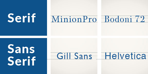
Font Selection
Image: Colorful felt letterforms on a black background.
Overview
Legibility, readability and the logical structure of information are essential factors for good communication design, even more so when we consider accessibility. Much like colour contrast, accessible typography considers readers with print disabilities while the structure of the document supports assistive technology users. As designers, the choices we make in the construction and presentation of our documents can have an impact on how easily information can be perceived and understood which ultimately benefits everyone. Given that reading is not linear and dependent on recognizing shapes, good typographic choices can reduce cognitive load and makes the content more approachable. Clear hierarchy also contributes to the legibility and readability for both visual and non-visual readers. Fundamental typographic principles and page layout best practices already support accessibility by encouraging easy-to-read content however there are a few special considerations to ensure that our communication is as accessible as possible.
Developing an Understanding
It is recommended to select typefaces with open counters and obvious ascenders and descenders. Avoid typefaces with ambiguous letter forms, ensuring each letter is unique and easily identifiable. A good practice is to compare the lower case ‘l’ , uppercase ‘i’ and the number ‘1’. Typefaces that have distinct shapes for each glyph assist the reader in recognizing words to improve readability. In addition, avoid typefaces that use mirrored letter forms for lowercase ‘b’ and ‘d’ or ‘p’ and ‘q’ as they can cause confusion for some readers with cognitive disabilities.
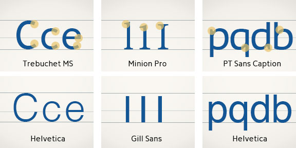
Typefaces with proportional spacing are recommended since the variability contributes to distinguishing letter forms. Condensed font styles may be harder to distinguish individual letters due to the narrow set widths and should be used sparingly.