Accessible
Interaction Design
User Interface (UI) Design
Designing for Usability
Image: Hand-drawn sketch of a web page layout.
Overview
As we have learned throughout this course, considering accessibility from the inception of a project makes inclusive design so much simpler. Web design and development is no different, from the initial concept, through the design of the pages and the eventual launch of the website. Questioning who the user is and how they will access this information is critical in achieving an accessible and inclusive design.
In this section we will look at some of the key considerations when designing web pages and deciding how information will be presented. This is also known as UI (User Interface) design which considers human-computer communication such as display screens, navigation and how information is organized and presented.
Developing an Understanding
Usability can be defined as how easy and pleasant the features on a web page are to use and whether it provides the features a user needs (Nielson Norman Group, 2021).
Accessibility and usability are overlapping principles; when the user experience is simple, intuitive, and easy to navigate, it lends itself to being more inclusive of users who have visual, cognitive, or mobility impairments (Boia.org, 2019).
Key components to consider for usability when designing for the web are:
- Learnability: How easy is it for users to accomplish basic tasks such as navigate from page to page. Does the page make use of expected usability patterns?
- Efficiency: Once users have learned the design, how quickly can they perform tasks? For those using assistive devices are there many compromises and work arounds that slow them down?
- Errors: How many errors do users make, how severe are these errors, and how easily can they recover from the errors? This is a key aspect for elements such as sign up or order forms for example.
- Satisfaction: How pleasant is it to use the design? Is the information clearly presented and easy to navigate?
— Adapted from Usability 101: Introduction to Usability opens in new window, Neilson Norman Group
Deepening your Understanding
To further explore how your design choices can affect the accessibility of your web content, let’s review some usability fundamentals and simple design choices you can make that will improve the experience for all users.
Page Layout
The organization of your text and images on the page can play a significant role in how easy the information is to navigate. Having a meaningful and logical structure to the content helps users find their way in the content when using assistive technologies. The page layout is determined in the content creation but also structurally in the HTML code.
This short video from W3C explains why a clear layout is important for accessibility and usability.
Typography
Choosing fonts and type sizes that are clear and easy to read can affect the overall usability of the page for all users. It’s important to remember that unlike print design, you can’t fully control how the text will display on a web page. Device orientation, size and zoom level will affect how the text displays. To maintain clear legibility of the text on your pages, here are some guidelines to consider:
- Use a minimum font size of 16px to ensure legibility.
- Maintain a line length of 45-75 characters to promote comfortable reading.
- Choose a typeface that has distinct letterforms. For example, the capitalized letter ‘I’, lower case ‘L’ and number 1 have distinct features.
- Avoid decorative typefaces such as Brush Script Std or Curlz for lengthy paragraphs.
— Adapted from Accessibility for Teams opens in new window
Colour Cues and Contrast
Colour plays an important role in creating focal points on the page. It’s important to recognize that not all users perceive colour in the same way which is why it’s essential to ensure that all text and icons meet the colour contrast ratio defined by the WCAG.
Colour can also be used to convey meaning and it’s important to recognize that colors mean different things in different countries and cultures opens in new window. In Western cultures, red is typically used to represent negative trends and green positive trends, but the opposite is true in Eastern and Asian cultures opens in new window (Smashing Magazine, 2018).
To ensure all content is perceivable to users, here are some guidelines to consider:
- Text and background have a colour contrast ratio of 4.5:1 and 3:1 for large text.
- Functional graphics and icons, such as arrows or ‘Home’ icon also meet the colour contrast ratio guidelines.
- Colour cues should be paired with complimentary text and icons. For example an input error in a form can display in red along with an ‘X’ icon and the words ‘Error’.
— Adapted from Accessibility for Teams opens in new window, accessibility.digital.gov
This short video from W3C explains how colour contrast helps makes the elements on the page distinguishable.

Task
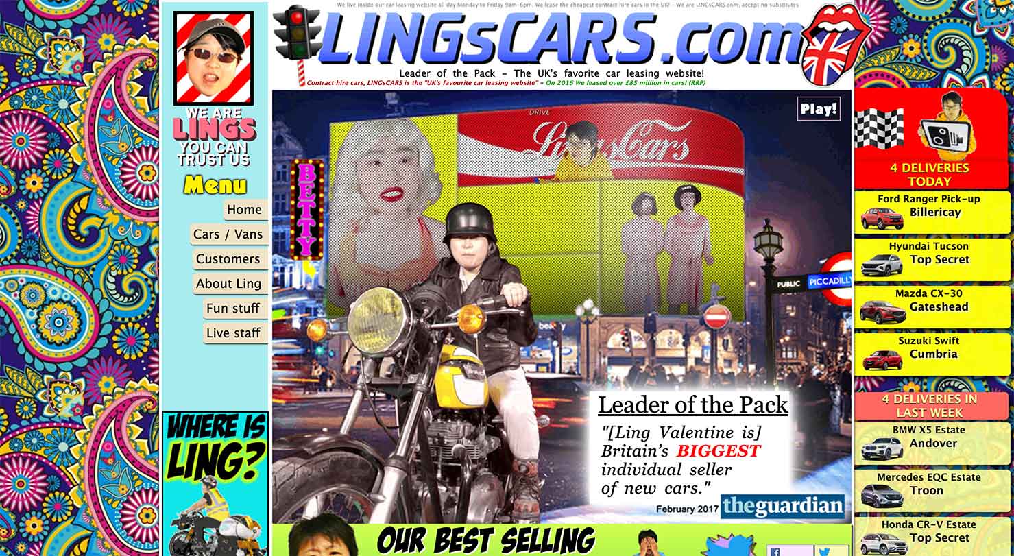
If we consider the guidelines that were discussed above, analyze this screenshot from LINGsCARS.com opens in new window below and identify as many accessibility barriers related to the visual design of the page.

Please pause the screen reader and fill in the textarea. Next, you will hear the answer.
Some of the accessibility concerns on this page would include:
- Colour contrast ratio
- Too many typefaces
- Lack of visual hierarchy
- Navigation is not easy to find


