Once upon a time, data was stored, presented and interpreted in its raw form. Numbers, facts and statistics were crammed into unappealing pie charts, line and bar graphs. Today, the art of data storytelling is transforming the way data is visualized, leading to a deeper understanding of facts and statistics. The mix of scientific data, art and visualization communicates better insights and informs a data-driven decision-making process.
Do you know how much data is produced every single day? Prepare to be amazed. A 2018 Forbes report revealed that 2.5 quintillion bytes of data are created each day, and that pace is accelerating with IoT (Internet of Things) growth. In fact, over the last few years alone, 90% of the data ever to have existed was generated! In 2019 the World Economic Forum predicted that the entire digital universe would reach 44 zettabytes by 2020. That’s a lot of data!
The Power of Storytelling
Businesses, academic institutes and researchers alike access, use, reframe and repurpose data to build a hypothesis and present it to support their findings and drive change. Data geeks quickly digest raw data as they seem to have a secret talent for decoding it. However, the general population needs guidance to understand the data; these users understand stories better than data.
While the science of data narratives, or ‘Data Storytelling’, is a relatively new concept, the science of storytelling is a widely recognized aspect in how our brain remembers and processes information. Researchers know that interpreting facts activates the brain’s Broca’s area and Wernicke’s area, while narratives and stories activate many other parts of our brains. Research by the late cognitive psychologist Jerome Bruner found people are 22 times more likely to remember facts if they are delivered within a story. ‘Storytelling’ is becoming a widely accepted management tool across the board.
Storytelling as a management tool has four major strengths.
Firstly, storytelling facilitates the integration of emotion and personal values as part of the management decision-making process. Secondly, storytelling facilitates the packaging of complex situations into a contextual framework which enhances the understanding of the listener of the issues at hand. Thirdly, effective storytelling can provide a vehicle for establishing, maintaining and expressing the values held by an organization. Finally, storytelling can harness the emotion and energy of an organization by moving its members to action. Emotion drives the movement from values to values-in-action which in turn drives the formation and maintenance of corporate culture and, by extension, the corporate (Grant, 2010).

The Power of Data Storytelling
What is the purpose of presenting data in the first place? The obvious answer is to understand it; to extract value from it; to gain insights from it; to come to an informative, reliable and unbiased conclusion and to act on it intelligently.
Why data storytelling? Research suggests that stories trigger the release of oxytocin, widely known as the ‘bonding’ or ‘love’ hormone. Brent Dykes, Director of Data Strategy, Domo, indicates: “People hear statistics, but they feel stories.” Storytelling instills an emotional connection between the teller and the listener. Data is, however, logical; do we need emotions? A few years ago, neuroscientist Antonio Damasio made a groundbreaking discovery as he studied people with damage in the part of the brain where emotions are generated. He found that they were both unable to feel emotions or arrive at a decision (Damasio, 2000). He demonstrated that emotions and feelings are a crucial contributing factor along with reason and logic in human decision-making processes.
Data storytelling is more than visually appealing data presentation.. Data stories are a combination of data, narrative and visuals to assist in communicating a way forward and influencing change based on data-driven insights. Data stories are purpose-driven.
Some thousands of years ago, Aristotle wrote about the best way a story should be told: a beginning, a middle and an end. Similarly, for data storytelling to be compelling, we can employ the same storytelling mindset to better inform and better understand data:
- Information Analysis: Often referred to as ‘Setup’ in the story narrative arc
- Hypothesis: Often referred to as ‘Conflict’ in the story narrative arc
- Recommendations/Conclusion: Often referred to as ‘Resolution’ in the story narrative arc
Data Storytelling Competition: Humber Research & Innovation
A data story is a way to present and explain the data and state why it matters. A data-driven story should be tailored to a specific audience and address a particular need or problem statement..
To put this theory to the test and prove its efficacy and efficiency, we recently held an in-house data storytelling competition. Led by Project Manager Barath Roy Michel, six teams comprised of research and project assistants competed to present their findings and recommendations based on a chosen topic to a panel of judges through the art of data storytelling.
Michel shares: “Data storytelling is a practice of bringing meaning to numbers. Data storytelling can unearth true potential behind the data being presented.”
.The best stories get told and re-told. Stories can make data compelling.
The Data Storytellers
Winning Team #1:
Juan Felipe Garcia, Project Assistant
Spoorthy Harish Babu, Research Assistant
Manivannan Kannan, Research Assistant

Gamification in Education
Data Source: Survey designed by the team
Gamification is a technique that designers use to insert gameplay elements in non-gaming settings to enhance user engagement with a product or service. This data story addressed the question, “do we need gamification in education to have an effective and efficient learning experience from Humber College students’ point-of-view?” The data was collected with the help of an internal survey to study how gamification is perceived, gathering data from students across Humber College. A link between gamification and intrinsic motivation was addressed. The team inferred that students, irrespective of age, want gamification models incorporated into education.
2nd place Team #2:
Nandish Dave, Project Assistant
Rajani Rajan, Research Assistant
Matthew Castaldo, Research Assistant

Heart Stroke Probability in Canada
Data Source: Canadian Chronic Disease Surveillance System (CCDSS)
The team looked at potential adverse health effects of increasingly sedentary lifestyles as a result of Covid-19’s longstanding lockdown measures. An increase in cardiovascular diseases far exceeded other conditions by a high margin. For comparison, the team used data over 20 years. The average death rate caused by cardiovascular diseases across countries was compared, breaking it down to Canada and province-wide. The team inferred that the death rate due to strokes is higher in age groups of 80, and that strokes are the 4th major cardiovascular disease leading to death. The team concluded that further research is required to study the cause of Ontario’s high stroke rate.
3rd place Team #3:
Moshe Shabazz, Research Assistant
Eswaran Badrinarayanan, Project Assistant
Rostyslav Vityak, Research Assistant.
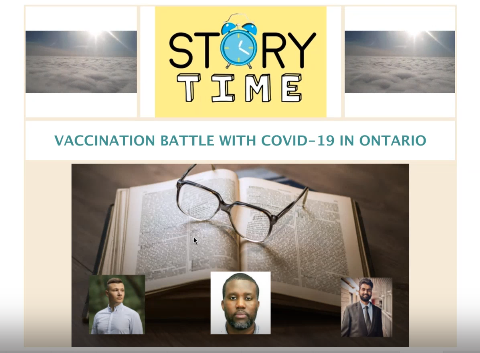
Vaccination Battle with COVID-19 in Ontario
Data Source: Statistics Canada
Countries that have progressively established vaccination labs and clinics have shown positive results in protecting individuals. Data was collected from January 25th, 2020 to April 18th, 2021 for Canada and broken down province-wide. The data analysis indicated that Ontario had the highest number of COVID cases, followed by Quebec and British Columbia, partially due to population density and the number of inbound flights into the province. 2021 has seen an increase over 2020 for all age groups, excluding 90+ and 80+. The team established that a steep decline in the number of deaths at long-term care homes was due to vaccinations, suggesting that even a single dose of vaccination effectively boosts immunity and protection. The team empathetically claimed being vaccinated is the best way to pass on a healthy community for our future generations.
Participating Team #4:
Ozan Kirali, Project Assistant
Gianfranco Molfino, Project Assistant
Avneet Singh, Research Assistant
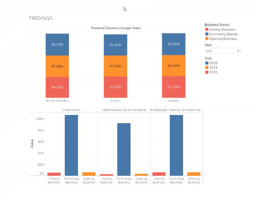
Success Rate in Entrepreneurship Ventures in Canada
Data Source: Statistics Canada
This project showcased the average rise or decline of entrepreneurship ventures over the past three years from three prominent industries: construction, healthcare & social assistance and professional scientific & technical services. The team focused on three provinces: Ontario, Quebec and British Columbia. The data collected was not limited to start-ups; it incorporated opening, continuing and closing businesses. The team inferred that continuing businesses and start-ups closely balanced out closing businesses, suggesting that a resilient economy will bounce back post-pandemic.
Participating Team #5:
Milan Patel, Project Assistant
Aarthi Rajam, Project Assistant.
Decade Look at Unemployment Rate in Canada
Data Source: Statistics Canada
This project focused on unemployment rates in Canada’s three territories, breaking data down demographically by age (15 & over, 25 & over, 55 & over), employment type (full-time, part-time and unemployed) and gender (male and female). Unemployment rate fluctuations were presented from 2010 to 2020, with unemployment peaking during the pandemic. The team provided a Tableau public link for the audience’s convenience for their easy view and reference. The team concluded with a hopeful note, awaiting a steady decline in the unemployment rate post-pandemic.
Participating Team #6:
Vimohi Shah, Research Assistant
Iren Panko, Research Assistant
Piyusha Lokre, Project Assistant
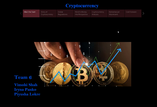
Cryptocurrency Analysis
Most of the data was sourced from Yahoo Finance
In this project, the team presented a timeline of the wide adoption of cryptocurrency in 2008 up to 2018, and found that some countries have levied heavy regulations on its use, while in some countries (such as China) it is illegal. Meanwhile, the Indian Supreme Court has lifted the banking ban on crypto exchanges, and Canada and the US allow the use of digital currencies. Using historical data, the team studied the top 23 most traded coins and inferred the best days to buy and sell. Market capitalization study indicated that Bitcoin was most valuable and the least, Dogecoin. The team concluded that three popular cryptocurrencies that have gained popularity are Bitcoin, Ethereum and Litecoin, forecasting growth for Bitcoin and Ethereum and a steady decline in value for Litecoin by 2023.
Design Tools
Participating teams used a variety of tools to capture their data stories. While Tableau was the preferred tool for data visualization, some teams used ANOVA Table and Linear Regression Models, and R for statistical computing. Interactive design tool Figma was used for its collaborative feature with Tableau, and teams also used Power BI and Excel. Participants skillfully exploited the comprehensive set of tools that the Tableau software offers to connect to different data sources effectively.
Participants expressed enthusiasm in utilizing this opportunity to enhance their data analytics and visualization skills. Acquisition of improved skills through applied learning went hand-in-hand with Humber’s philosophy of experiential learning; in this case, working with real-world data allowed each team member to apply their knowledge towards current issues.
Building a Good Data Story
Competing teams were guided and asked to take into consideration the following vital elements while preparing for the competition:
Keep it relevant
- Empathize: keep the audience in mind.
- Ask yourself: “what are you setting off to solve in the first place?”
- Identify: collect and curate reliable data; if needed, take steps to clean up dirty data.
Analyze good data
- Understand the correlation between different parameters in the dataset.
- Identify the questions that need to be addressed. If you can identify that, you can get the audience’s attention, build credibility and drive them to the action you are recommending.
- Perform a simple analysis using Pivot Tables based on questions formulated on the dataset.
- Document and rule out any assumptions that can be made based on the dataset.
- Collect further data, if needed, to support the assumptions, leading to factual statements.
- Perform analysis and present data with an analytical mindset.
Clear Narrative
- Build hypothesis: What is the data trying to tell you?
- Is there a pattern? What is it indicating? Inform your audience through clear context.
- Remember to utilize the narrative story arc format.
- Come up with conclusions and recommendations based on the dataset. What decisions can be made by looking at this dataset? Where are the trends leading to? Next steps?
Visuals Visuals Visuals
- Appropriate title and clear labels for the data being presented.
- Avoid overuse of colours and imagery.
- Clear markers and indicators to pinpoint the data that matters.
- Keep it simple.
- Remember ‘white space’!
Feedback from Judges
The judging panel was comprised of:
- Dr. Ginger Grant, Dean, Research & Innovation;
- Dr. Tania Massa, Associate Dean, Applied Research & Innovation;
- Dr. Laura Page, Program Administrator, Teaching Innovation Fund, SoTL, Research & Innovation;
- Raeshelle Morris, Innovation Program Manager, Research & Innovation;
- Dianna Dinevski, Research Specialist, Grant & Business Development, Research & Innovation;
- Professor David Weisz FMCA, Director, StoryLab; and
- Tanya Perdikoulias, Operations Manager, Research & Innovation.
Judges gave excellent feedback on the first-of-its-kind internal data storytelling competition. The teams prepared and presented their data eloquently and thoughtfully. Judges accorded input on keeping the aesthetics simple, stating, “simpler presentations require more effort and accuracy, as extrapolations from the data, strategic intent and recommendations based on it have to be carefully thought out.” Participants were encouraged to make further in-depth inferences and justify conclusions after thoroughly cleaning up data from reliable sources before a presentation. To ‘adopt a meditative pace during presentations’ was another mindful observation made. Teams were commended on their attempts to recommend next steps and predict trends.
All winning and participating teams were awarded gift cards from Amazon.
The participants asserted that through the experience of this data storytelling competition, which required them to apply an analytical mindset, they were able to better implement the vast capabilities of Tableau and other tools efficiently within a short period. They were confident and eager to be provided with a future opportunity to conduct in-depth research and analysis on their respective team project to sharpen their skills.
When asked if they would be willing to participate in an inter-departmental or cross-sectoral data storytelling competition, the feedback was affirmative across the board.
Upcoming Workshops
Is data storytelling a skill you wish to harness? Have you explored or incorporated data storytelling in your department or organization? Have these stories been effective in engaging with your audience?
Humber College faculty members interested in exploring and learning more about data analytics and data storytelling are encouraged to watch this space for the announcement of an upcoming workshops on this area, tentatively planned during the third week of June 2021. We will be broadcasting the workshop through Humber Communique as well. Project Manager Barath Roy Michel and Professor David Weisz, FMCA, will facilitate the workshop.
References
Marr, Bernard. (2018, May 21). How much data do we create every day? The mind-blowing stats everyone should read. Forbes. https://www.forbes.com/sites/bernardmarr/2018/05/21/how-much-data-do-we-create-every-day-the-mind-blowing-stats-everyone-should-read/?sh=1e8219d260ba
Jeff Desjardins, F. (2019, Apr 17). How much data is generated each day? World Economic Forum. https://www.weforum.org/agenda/2019/04/how-much-data-is-generated-each-day-cf4bddf29f/
JGR Communication. (2016, March 21). The real science to how storytelling affects the brain. https://jgrcommunications.com/the-real-science-to-how-storytelling-affects-the-brain/
Pecoraro, A. (2019, Nov 21). How storytelling bolsters financial plans and client relationships. ThinkAdvisor. https://www.thinkadvisor.com/2019/11/21/how-storytelling-bolsters-financial-plans-client-relationships/
Zak, P. (2015). Why inspiring stories make us react: The neuroscience of narrative. Cerebrum, 2. https://www.ncbi.nlm.nih.gov/pmc/articles/PMC4445577/
Grant, G., & Holmes, W. R. (2010). Effective storytelling in business school ethics curriculum. Publications and Scholarship, 10. https://source.sheridancollege.ca/pilon_publ/10
Bechara, A., Damasio, H., & Damasio, A. R. (2000). Emotion, decision making and the orbitofrontal cortex. Cerebral Cortex, 10(3), 295-307. https://doi-org.ezproxy.humber.ca/10.1093/cercor/10.3.295
